-3
Comment dessiner un demi-cercle comme cette image en CSS. 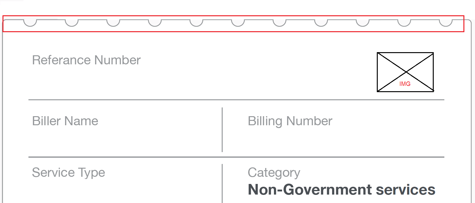 Dessin d'un demi-cercle en CSS
et en utilisant uniquement les définitions CSS. Pas de SVG, WebGL, DirectX autorisés.
Comment dessiner un demi-cercle comme cette image en CSS. Dessin d'un demi-cercle en CSS
et en utilisant uniquement les définitions CSS. Pas de SVG, WebGL, DirectX autorisés.
Quelque chose comme ça marcherait probablement:
.box {

    width: 604px;

    border-width: 0 1px 1px;

    border-color: #ddd;

    border-style: solid;

    overflow: hidden;

}

.circles {

    border-top: 1px solid #ddd;

    display: flex;

    list-style-type: none;

    margin: 0;

}


.circles li {

    background-color: white;

    width: 30px;

    height: 30px;

    border-radius: 100%;

    border-width: 0 1px 1px;

    border-color: #ddd;

    border-style: solid;

    margin: 0 17px;

    position: relative;

    transform: translateY(-50%);

}
<div class="box">
<ul class="circles">
<li></li>
<li></li>
<li></li>
<li></li>
<li></li>
<li></li>
<li></li>
<li></li>
</ul>
Circles for the win
</div>Grande réponse homme! –
image que vous regardez est défini comme arrière-plan avec la propriété répétition x. C'est pourquoi ça ressemble à une bordure ronde. – tilz0R